This week Cyentia partnered with RiskRecon to cover the Risk Surface Report. This is the first report in a series covering organizational and third (and fourth and…) party risk. The report lays out risk landscape across a number of different dimensions. You should go read it right now! But here I want to talk about one of the more compelling charts in the report, ternary plots.
A funny triangle plot
Often I find myself trying to understand the relationship between 3 or more variables, and just wishing there were good ways to really see the underlying relationships. This is frequently true in security where we often have categorical ratings like Low, Medium and High. Of course color and size variations for things like scatterplots can come close, but the eye isn’t as good at understanding those patterns as it is understanding spatial patterns. Therefor, unless there is a clear trend and relatively sparse data, often including size or color variations doesn’t add much to the chart.
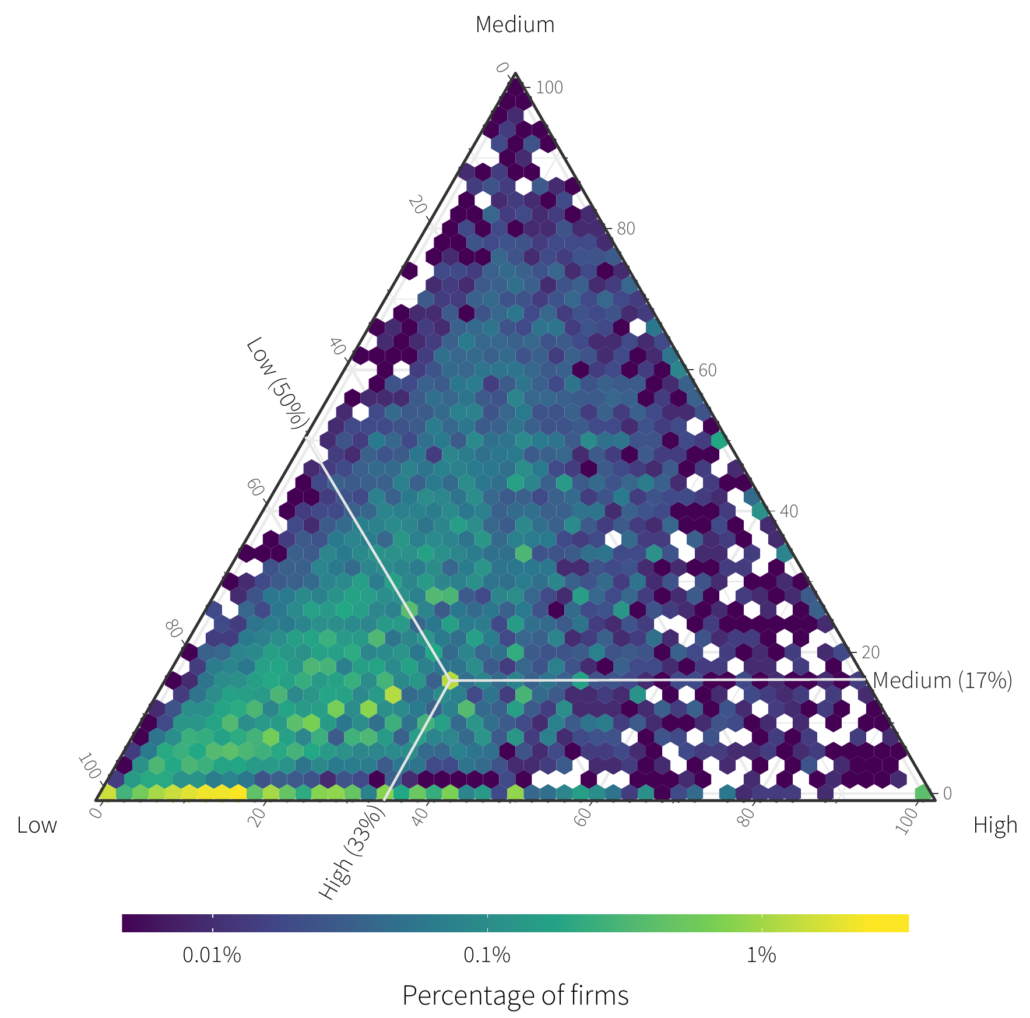
There is however one way to visualize a specific type of three dimensional data called ternary plots. In fact, we employ these in our upcoming RiskRecon Risk Surface Report, specifically Figure 13 which appears below.
We are going to build up to the chart above, so don’t spend too much time pouring over it yet.
3 values in 2 dimensions…
Our goal is to understand how the value of internet facing hosts spread out across organizations. RiskRecon categorizes hosts into 3 different value categories: Low, Medium and High. Each organization then has some fraction of each. This leaves us with three variables to try to visualize. Let’s start by making a scatterplot and use color as our 3rd dimension.
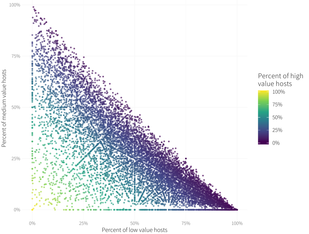
Each organization here is a point, its percentage of “low” valued hosts is on the horizontal axis, its percentage of “medium” value on the vertical, and it is colored by the percentage of “high” value hosts.
- There are some interesting patterns within the points. These emerge because in our calculation of fractions like 1/2 and 1/3 that emerge because of how proportions of calculated out of a total number. They are only members of the rationals not the reals for you math folks.
- No organization lies above the diagonal of the line bisected from (0,1) to (1,0). This boundary represents organizations have that have all Low or Medium value hosts. Anything above that would imply that the sum of a firm’s value proportions exceeds 100%, something that isn’t possible.
- Finally, we note that the color smoothly follows from dark purple (0% High value hosts) to yellow moving away from that boundary line.
Unfortunately because of the density of points there isn’t much we can say about the distribution of host value here. Perhaps it’s a bit more dense towards the lower right (many low value hosts), but it’s difficult to tell. What we really need is a three dimensional plot of this data..
3 values in 3 dimensions
Here is that same data in 3 dimensions (courtesy of plotly). Note this isn’t the actual data, but rather a reasonable facsimile of it as we didn’t want to include RiskRecon data in an embedded plot.
Figure 3 Ternary data plotted in 3 dimensional space
Huh, that triangle looks familiar. If you take a look at the plot above you’ll notice the points don’t fill the 3D space, they all lie on a single 2D plane embedded in the 3D space. A more math-y way to say this is it lies on the 2-simplex in R3. This is a direct result of the fact we are looking at a partition of value into three different quantities, and this is a requirement for ternary plots to make sense. *Ternary plots only work if you are visualizing three variables that represent proportions that add up to 100%*.
Ternary plots are a projection of that triangle into 2D space. Let’s look at that same chart projected (courtesy of ggtern).
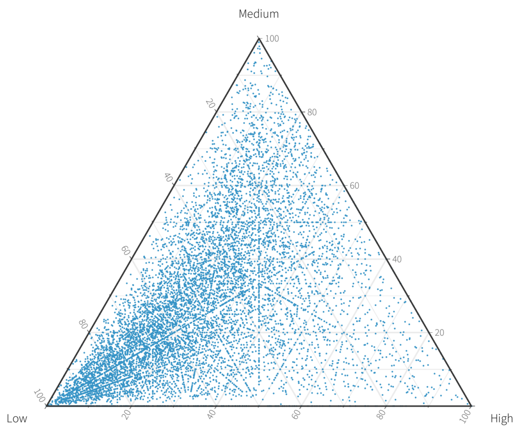
Reading ternary plots
But how do we read ternary plots of these plots? Almost the exact same way we can read 2D plots, except we have to draw one more line and draw them at funny angles. On a 2D chart, say the one we had above, if we wanted to know the value of a single point, we’d find that point and draw a horizontal line to the vertical axis and a vertical line to the horizontal axis and read the numbers. Like this on our previous figure:
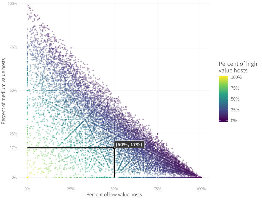
Of course we’d also have to match the color we find at that location back to the scale on the right. That’s going to be fraught with uncertainty even when we use the viridis colormap.
We can do the same thing with the ternary chart, we just have to draw the lines at specific angles and draw one to each of our axis.
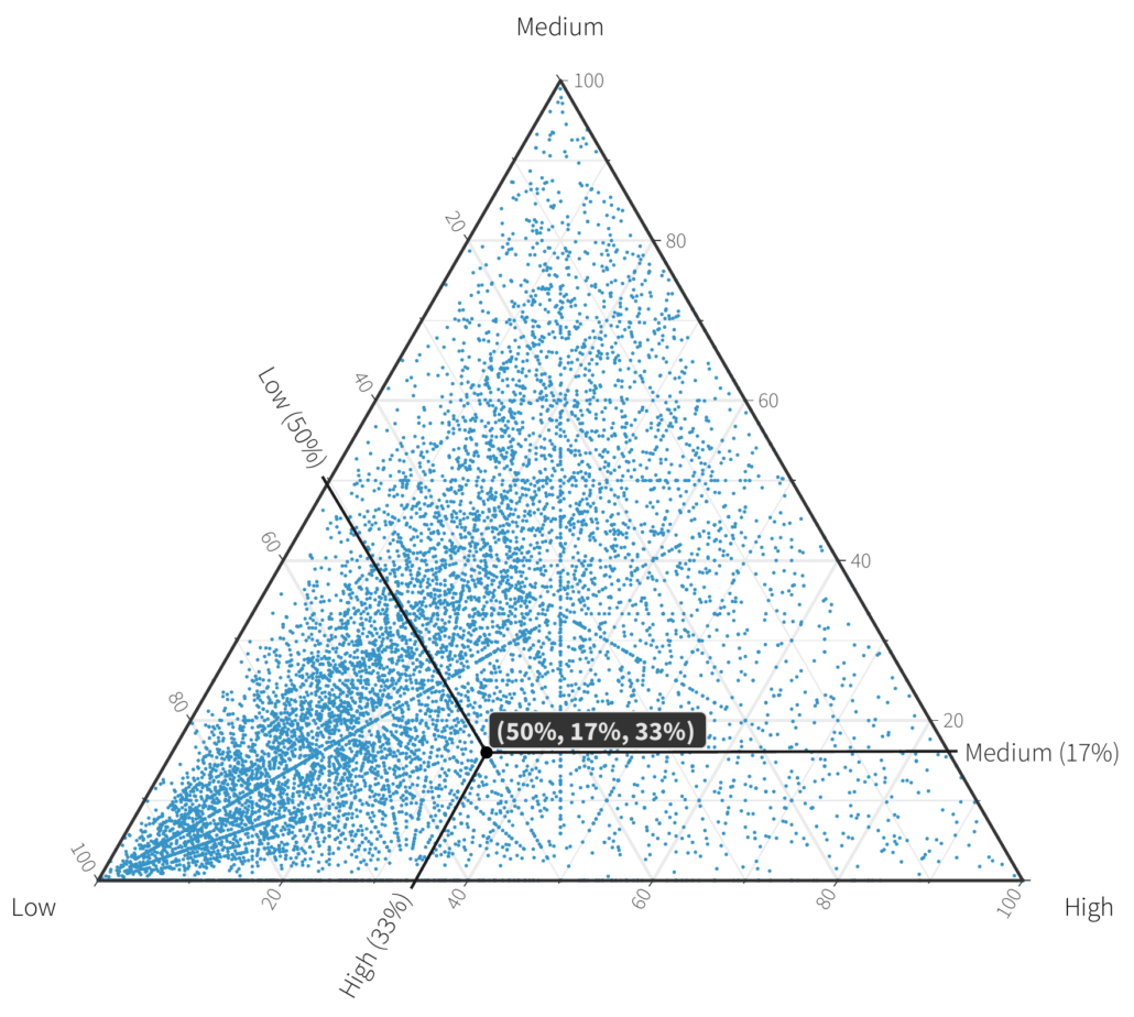
The tick-marks on the chart give an indication of the angle to draw the lines. Let’s spell it out in words as well. Assuming 0 degrees is the horizontal axis, and angles increasing going counter clockwise.
- Start at the point of interest.
- For the low percentage draw upwards towards the “left” axis at a 120 degree angle.
- Next, for the medium percentage draw right towards the “right” axis at a 0 degree angle.
- Finally, for the high percentage draw downwards towards the ‘bottom’ axis at a 240 degree angle. Wherever you land on the axis is the percentage for that axis. This also implies a few other things. Any corner represents 100% of the labeled corner. Moving along the axis means that there is a split between the values at the two corners with 0% in the other category. For example, organizations on the left axis have only low and medium hosts.
Actually answering the original question
At this point we might be tempted to get a little crazy. And we did. Here is a chart that hit the cutting room floor for the final report.
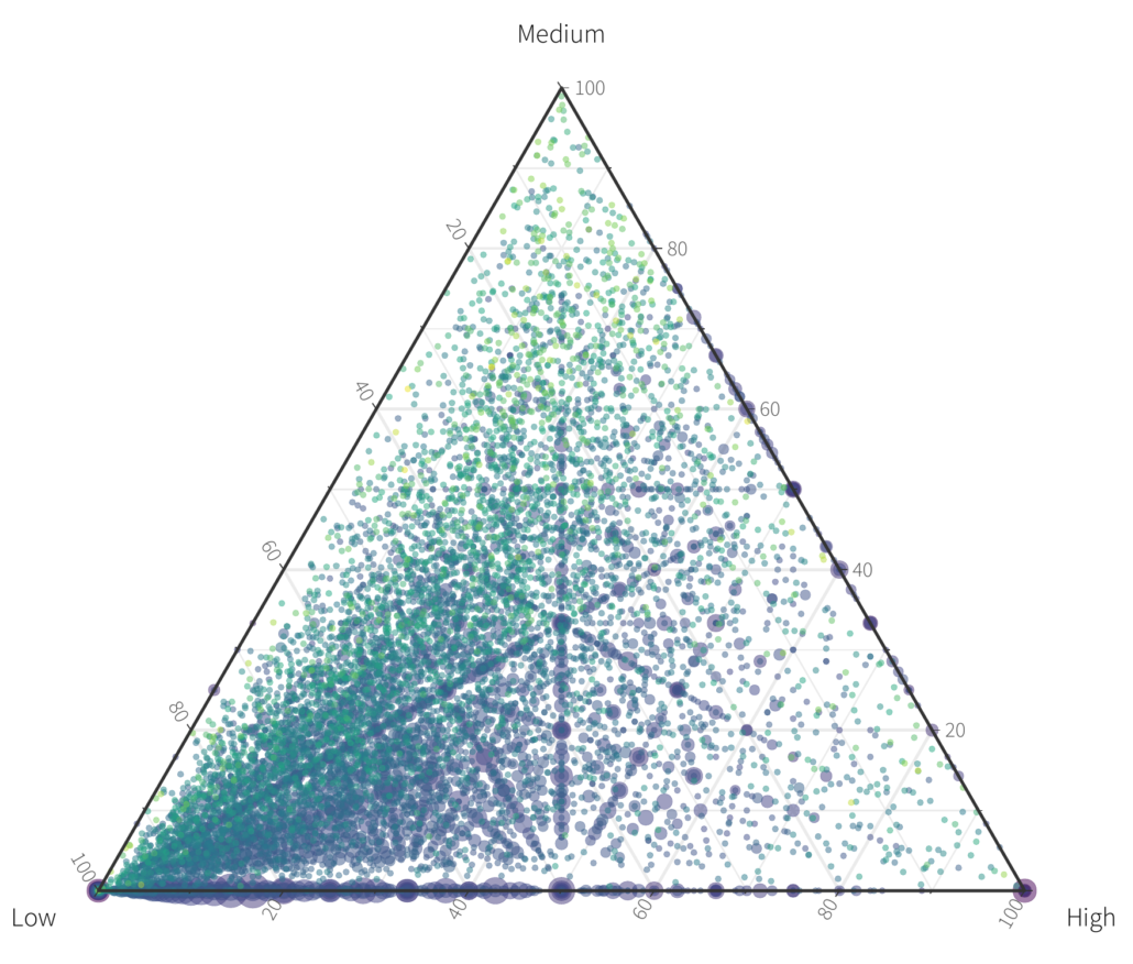
Above is the same scatterplot except each orgs total number of hosts is colored using the viridis colormap, and the size represents the number of orgs that fall at that particular point. It’s pretty obvious we can’t tell much from the above. Our initial question was “What is the distribution of value across organizations?”, and for this a density plot works well. Instead of making a scatterplot we can make a hexbin plot with coloring each hex by how many organizations fall within the bin.
From this chart we can actually answer this question. Perhaps unsurprisingly, most organizations have a higher proportion of low value assets than anything else (lower right corner). But it’s significant to note that there are organizations that deal exclusively in Low, Medium or High value assets, or just two out of the 3. We also see some bright spots. The one we annotate is 50% low value, 1/3 high value and 1/6 medium value.
The journey doesn’t end here
Hopefully this introduction to ternary charts gives you an idea of to understand them when you come across them, when to use them (only when three variables represent proportions of a whole), and helps you make your own when you’re lucky enough to have such data. Sometimes viz can be straightforward (who doesn’t love a good scatterplot?), but sometimes more complex data requires slightly more complex visualizations. Taking a bit of time with viz like this can help us better understand data and the world from which it comes. The road of data analysis goes ever on…