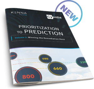
 The Prioritization to Prediction report series is an ongoing research initiative between Kenna Security and the Cyentia Institute. The first volume proposed a model for predicting which of the numerous hardware and software vulnerabilities published each month were most likely to be exploited, and thus deserving of priority remediation. The second volume sought to apply and test that theoretical model using empirical data collected on billions of vulnerabilities observed in production environments. We ended the last report by analyzing vulnerability remediation timeframes across a sample of 12 firms. This third volume picks up there and expands the analysis to roughly 300 organizations of different types and sizes.
I could talk your ear off about this report, but I’m just going to focus on one chart – Figure 19. As Jay was working his dataviz magic on the first 18 charts exploring vulnerability remediation timelines, I had this nagging suspicion that the data was still hiding some important lesson we needed to find. My suspicions were aroused by what we saw when examining the effect of organization size on remediation—namely, that the median time-to-remediate vulnerabilities varied little between SMBs and enterprises. This suggested to me that the benefits of having additional resources may be offset by the challenges of larger IT environments. “Complexity trumps capacity” was the phrase that came to mind.
In Search of Remediation Capacity
So, I felt we needed a way to measure remediation capacity, and Jay was able to work his magic yet again to oblige me. For each of the ~300 organizations in our dataset, we calculated the total number of open (unremediated) vulnerabilities in the environment and the total number closed each month. We then averaged that over the active timeframe to get a monthly open-to-closed comparison for each organization and created a log-log regression model. The results are recorded in the figure below, where each organization is plotted along the grid. And those results are INSANE!
 The R2 statistic for this log-log regression model is 0 .93, meaning that it’s very strong and captures most of the variability around vulnerability closure rates. You can see this visually in the figure because all the points—which represent the remediation capacity for each firm—fit tightly along the regression line.
Strong models are great, but there’s something else we learned that’s greater still. Notice first that each axis is presented on a log scale, increasing by multiples of 10. Now, follow the regression line from the bottom left to upper right . See how every tenfold increase in open vulnerabilities is met with a roughly tenfold increase in closed vulnerabilities?
That, in a nutshell, is why it feels like your vulnerability management program always struggles to keep up. A typical organization, regardless of the number of assets/vulnerabilities in their environment, will have the capacity to remediate about one out of every 10 vulnerabilities within a given month. That seems to hold true for firms large, small, and anywhere in between.
Seeing these results emerge after days of crunching numbers was one of those jaw-dropping “I can’t believe I’m seeing this” moments that make what we do here at Cyentia so much fun. And the fun didn’t stop there. We identified organizations that managed to significantly exceed that threshold, and began seeking more information about what set them apart. But I promised to cover only one chart/angle in this blog post, so I’ll refer you to the full report to see what we uncovered about the top performers. I promise – it’s worth the read.





Leave a Reply
Want to join the discussion?Feel free to contribute!