Fair warning: This post summarizes years of in-depth research on vulnerability remediation rates. There’s no way to do justice to all the ins and outs of that research…but I’m gonna do my darnedest to hit the highlights. There are hundreds of published pages to dig into if you think I’ve brushed over too many details (I kinda hope you do, honestly).
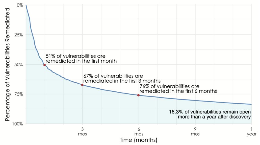
There are many ways one could measure how quickly vulnerabilities are patched. Most go with a simple average, but as Jay recently posted, such point statistics are a poor representation of what’s really happening with remediation timeframes. Our favored method for this is survival analysis. I won’t get into the methodology here other than to say it tracks the “death” (remediation) of vulnerabilities over time to produce a curve that looks like this. Those wanting a single stat can just go with the half-life (50% closed in the first month), but others will appreciate the shape of the curve that illustrates the long tail of remediation (16% of vulns open for more than a year).
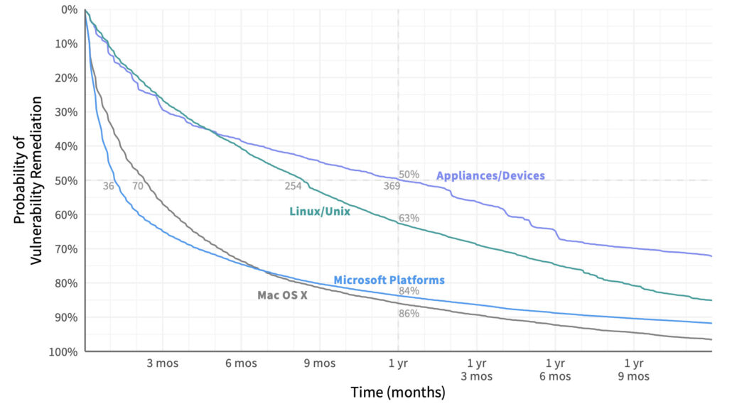
An overall survival curve like this grants useful insight, but even more so when we compare them among different groups of vulnerabilities. Let’s do that for vulns affecting different categories of assets under management. Here we can see that the half-life of vulnerabilities in a Microsoft system is 36 days. For network appliances and devices, that jumps tenfold to 369 days! After one year, only about 15% of bugs remain on Mac OSX and Microsoft devices, but Linux/Unix systems and network appliances still have a lot of work ahead of them. Based on this information, an organization may wish to tailor remediation priorities, processes, and SLAs by asset type.
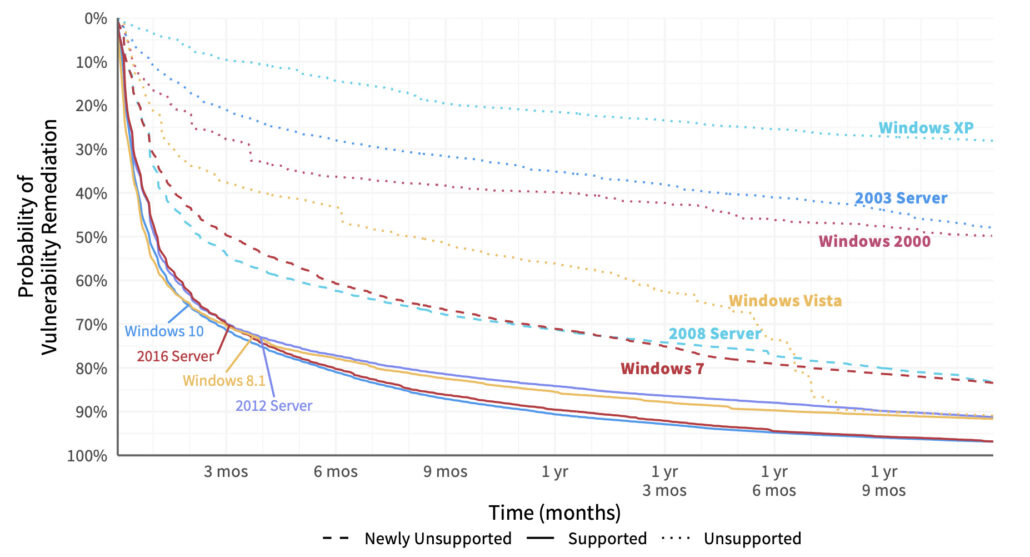
But we can go even deeper into the remediation rabbit hole. Let’s split out that vuln survival curve for Microsoft for different versions of Windows to see what we can learn. The newer versions of Windows (at least when we created this chart a few years ago) cluster at the bottom with steep, convex curves conveying fast patch deployment. Unsupported versions (indicated with dotted lines) languish along at the top. Clearly, that milestone in a platform’s life makes it much more difficult to manage vulnerabilities in a timely manner (or even at all). Mainstream support had ended for the dashed-line versions in the middle when we pulled this data, but extended support was still available at the time. If you’re looking for data to show upper management that squeezing a little more life out of those legacy Windows servers and desktops is a bad idea, this should do the trick.
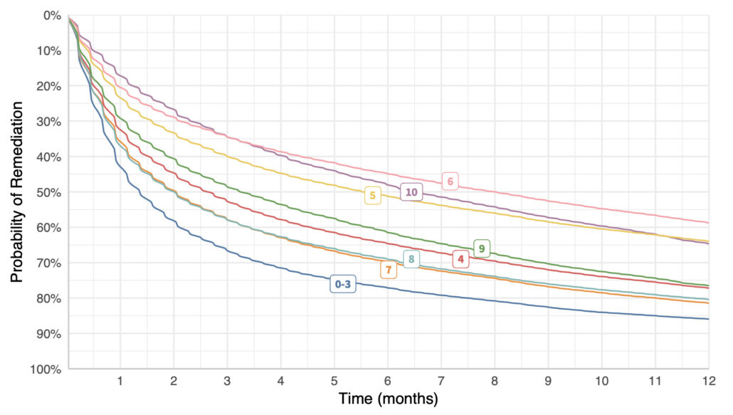
Ooh – I know. Let’s see if vulns with high CVSS scores are remediated faster than those with low scores. Surely so, right? Right? Uh, wait a tick…vulns with the lowest CVSS scores (0-3) are fixed the fastest, while 10’s are among the slowest. Here’s my shocked face (°0°)
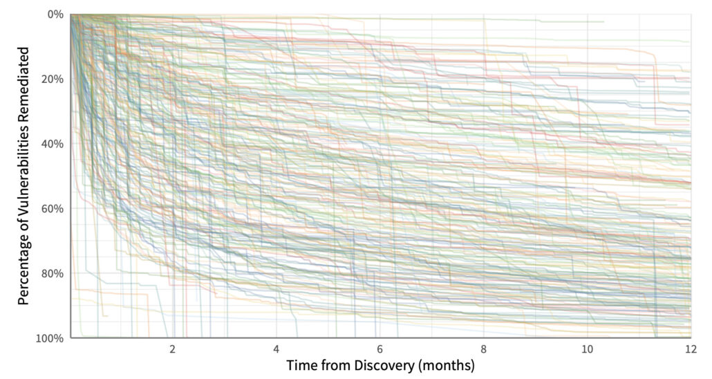
Ok..that’s probably enough. Hopefully, you can see that we could take any grouping of vulns, create a survival curve, and learn something interesting and/or useful about remediation. But we can also use this technique to compare different organizations or firmographic slices. Here’s a giant hairball of a chart showing remediation timelines for individual organizations across all their vulnerabilities. I advise against trying to make visual sense out of it – just take away the point that some organizations patch really fast, while others are really slow. And maybe wonder what differentiates them.
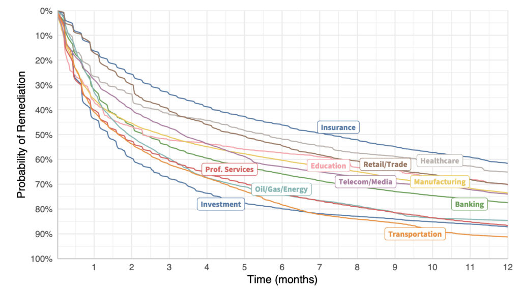
Let’s see if we can clean that up a bit. Creating vulnerability survival curves for organizations in similar sectors yields the chart below. The lesson? Get remediation strategy advice from your investment firm rather than your insurer, perhaps? We could ask a bunch of other questions about why certain types of organizations struggle more than others to address vulnerabilities…but this isn’t that post.
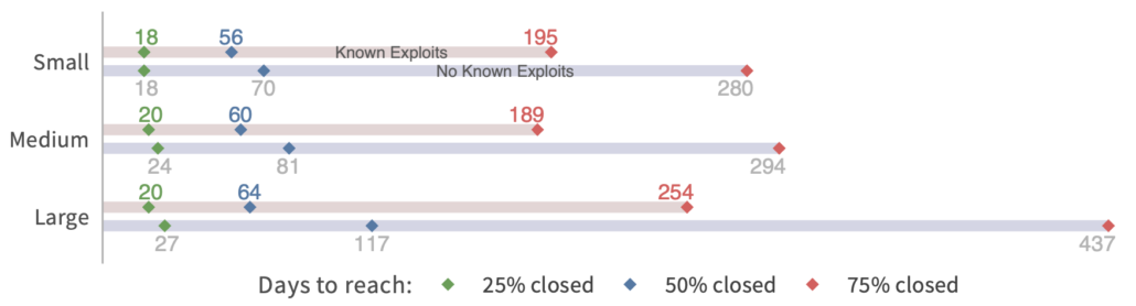
We can also compare remediation rates across different sizes of organizations. But I’ll need to change the format because I don’t have the curves created for this one. The chart below uses the same method of survival analysis but condenses the presentation to highlight how long it takes to close 25%, 50%, and 75% of open vulns. I find this one interesting, because there’s not much difference in fix speeds between small, medium, and large organizations (based on employee size). Large orgs certainly have more resources to throw at the patching problem…but they also have a lot more stuff to patch.
There’s a second aspect to this chart because it also compares remediation velocity for vulns with known exploits vs. those with no known exploits. Note that the gap is widest for large organizations. I suspect that’s because they have more vulns vying for attention and need to prioritize those that matter most. They defer remediation of non-exploited vulns for hundreds of days in order to focus on the riskiest ones. That’s a smart strategy.
System 1 and System 2 Patching
You may have caught the title of this post being a reference to Daniel Kahneman’s book “Thinking, Fast and Slow.” That was partly because it’s catchy and fits the topic. But I also think there’s a parallel to be drawn from one of the main points of that book. Kahneman describes two basic types of thinking that drive human decision-making:
- System 1: Fast, automatic, frequent, emotional, stereotypic, unconscious
- System 2: Slow, effortful, infrequent, logical, calculating, conscious
Maybe you see where I’m headed here. I’m not saying we can boil all patching down to just two different approaches. But my experience and research support the notion that there are two broad systems at play. Many assets lend themselves to automated, fast deployment of patches without much additional preparation or evaluation (e.g., newer versions of Windows and OSX). Those fall under System 1 patching.
Other assets require manual intervention, testing, risk evaluation, or additional effort to deploy. That fits the System 2 definition well. The more your organization has to engage in System 2 rather than System 1 patching, the slower and shallower those remediation timelines will appear. Like normal decisions, we can’t do everything via System 1…some assets need that extra System 2 treatment. But problems (and/or delays) arise when there’s a mismatch between the system used and the decision (remediation) scenario.
My takeaway for vulnerability management programs? Use System 1 patching as much as possible and System 2 patching only where necessary.
***
Note: All of these charts come from published volumes in the Prioritization to Prediction research series between Cyentia Institute and Kenna Security (now Cisco). I’ll link to Volume 5: In Search of Assets at Risk, since more charts came from that one than any other.