Confession time… every time I hear someone cite a statistic around “mean (or median) time to remediate (MTTR)” within cyber security, I have a wave of skepticism wash over me and I find myself questioning the MTTR statistic, adding to my skepticism is a general lack of transparency about how it’s calculated. Now, I’ve been generating and consuming cyber security statistics for many years now so this is a hard-earned position of skepticism that has built up over my career. Because here’s the truth: generating the mean time to remediate is not an easy calculation and most often can only be estimated or approximated.
Hopefully we can walk through an example together because I come bearing data. I started with 3.6 billion (yeah, billion with a “b”) observations of vulnerabilities on assets across hundreds of organizations courtesy of our research partnership with Kenna (now Cisco Vulnerability Management). Nobody wants to go through that amount of data for a simple walkthrough, so I derived a representative sample. However, it doesn’t really matter if it is representative, it could be totally random data because this is just an example. But I figured it’d help build our intuition if it was as close to real data as possible. So grab the data and before you read on, maybe try to calculate the MTTR as you think it should be done. 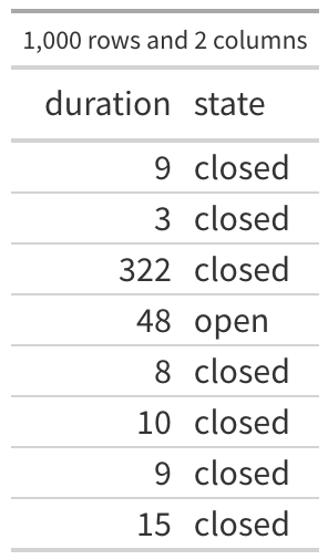
Got an MTTR? Okay, let’s continue…
The first few rows of the data are shown in the first table and there are 1000 rows (observations) and 2 variables (columns) in this data. There are 750 observations of closed vulnerabilities and 250 observations of vulnerabilities that were still open when we collected that data (roughly 23.7% of my 3.6 billion observations were still open). The first observation in the table says that a vulnerability was seen for 9 days and then it was closed, the third one was open for 322 days and closed, the fourth observation was open for 48 and as far as we know, it is still open. So all we know is that particular vulnerability was open at least 48 days.
Before we jump into the calculations, let’s set a frame of reference here. The purpose of “MTTR” is to establish some type of expected, central timeline for a vulnerability to be closed. If I observed a single vulnerability and I know the MTTR, I could assume this one vulnerability will be closed on or around that MTTR, right? Okay, let’s see what we can estimate.
Method #1
The most obvious (and most ubiquitous) method is quite intuitive. It’s also quite unreliable which is the main source of my skepticism in MTTRs. The logic is, if we are trying to measure the average time to remediation. We look at everything that’s been remediated and calculate an average. Simple right? That means that we ignore anything not yet remediated, but that’s probably okay because we only care about those remediated. That makes sense, doesn’t it? Let’s try this out. Before we just go crazy with some math though, we should visually explore what that data looks like. I’ll create a histogram, binning the durations up into months and I’ll plot the closed as well as the (still) open vulnerabilities, ya know, just for fun. 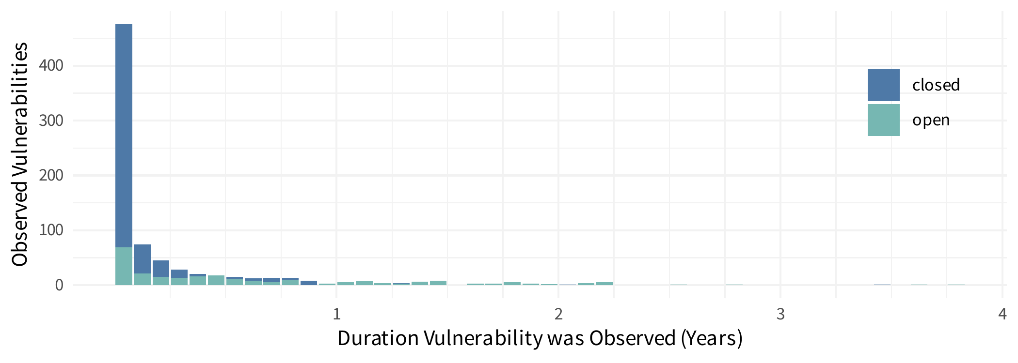
Now let’s calculate the average (arithmetic mean) on all the remediated vulnerabilities. If you’re trying this at home, you should end up with about 70 days. Maybe the astute readers see the above plot and recognize that this data is heavily skewed (or “long-tailed”) and maybe you know calculating a mean on skewed data can be misleading, so you swap to the median. In this data, the median time to remediate is 20 days (again, only looking at vulnerabilities that were remediated and closed).
The mean is calculating the arithmetic “middle” taking into account the values and weights they bring to the calculation. This means the arithmetic mean can be highly influenced by extreme values, and it’s why a mean can be misleading on skewed or heavy-tailed data. The median however just seeks the “center” where 50% of the observations are below and 50% of the observations are above. The fact that the mean and median are so far apart is another good (non-visual) indication that this is long-tailed data.
Let’s not pass judgment quite yet on if this is a good/bad/unreliable/amazing method, instead hold on to these numbers and keep going with some alternative techniques.
Method #2
Again, this is an intuitive approach, and it tries to include the open vulns. Maybe the open vulnerabilities is a major portion of the observations. Maybe we know there’s information and we’d like to include the open observations. So what to do? Well intuitively, we could assume the open vulns were closed at the last observed duration. Now I don’t know of anyone that would feel comfortable with that assumption, clearly it is incorrect. But what else can we do? We have no idea how long they will be open, but we know it’s at least that long. So maybe this is an okay approach?
If we apply this method to the sample data, we calculate the mean time to remediate at 108 days, and the median time to remediate at 24 days. Not too far off from the first approach. By including the open vulnerabilities both MTTR calculations were longer, which means that maybe the open vulnerabilities are generally open longer than the closed vulnerabilities (think about why that is). And again, let’s just hold onto those numbers and try one more technique.
Method #3
Welcome to survival analysis. I know the term may be a bit scary, even for some statisticians because “survival analysis” is a broad label for a specialized field of statistics and encompasses a wide range of techniques. We are going to start (and end) with a rather simple technique: a Kaplan-Meier curve. I’m going to step through how to calculate this curve by hand, but it should not be necessary to do any of this by hand (and you probably shouldn’t), most languages have some type of package or existing function to calculate this (there are even plugins for excel).
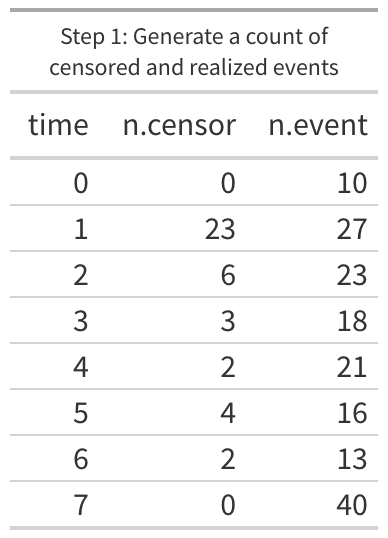 To start out, we have to munge the data a bit. For every duration we want to know two things, how many vulnerabilities lasted to this duration and are 1) still open and how many 2) were closed at this duration. Within survival analysis we use the term “censored” for any duration that hasn’t any remediation (technically “right censored” since we know when we first observed the vulnerability but not the last and everyone knows time flows left to right). When remediation occurs we call that an “event”. After some aggregating and counting the first few lines of the data should now look like the “Step 1” figure. Looking at the table, we know that the day after the vulnerability was discovered (where time is 1 or “day 1”), 23 of the vulnerabilities were still open and they haven’t been checked since then, so we know that 23 were open at least a day but we really do not know when they were closed. We still want to count them and we will in the next two steps. But we also know that 27 vulnerabilities were scanned on the day after they were discovered and found to be remediated (“n.event”). There should be a single row for every unique “time” in the data (in our example data we should have 291 rows after step 1).
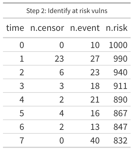
The second step may require some effort depending on your choice of tools, but we want a column of data that represents the total number of observations that made it to the time in that specific row. In our sample data, we know we are starting with 1000, so we could put that in day 0, then subtract the 10 events on day 0 and put 990 on day 1, then subtract 50 (23 + 27) to get 940 on day 2 and so on down the line. Another option is to flip it around so it is sorted by the time in descending order and then cumulatively add the censored and event data down to day 0 at the bottom. Because one of the main applications of survival analysis is, well, patient survival rates, this new column is typically counting the patients “at risk” of dying. Which doesn’t make much sense in our case, we don’t want to know how many vulnerabilities are “at risk” of being remediated, but let’s keep the column name consistent with tradition.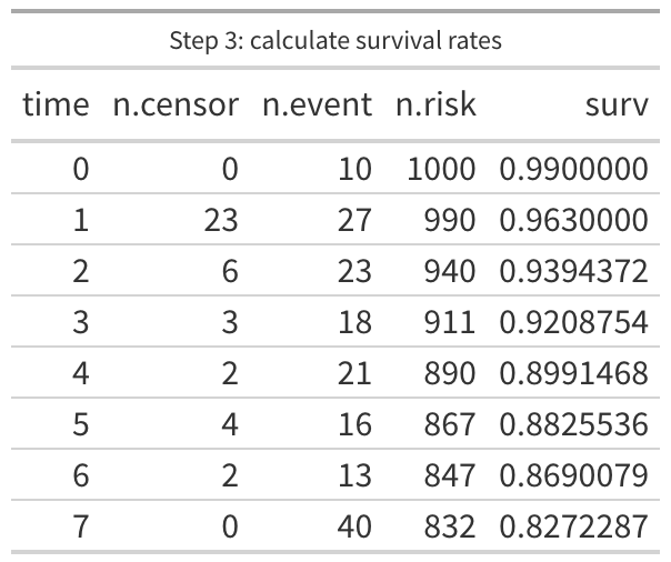
The last step is a little tricky and it’s actually two steps to calculate the survival rate, but I do this with a single calculation. We want to first estimate the likelihood of an event, in other words, we want to divide the number of events by the number at risk. Day 0 would be 10/1000, day 1 is 27/990, day 2 is 23/940 and so on. But we want to know the likelihood of surviving to the next day, so we subtract the first answer from 1 (so the first half of this calculation is 1 – (n.event / n.risk)). The second half of this step is to multiply the first half against the final result from the previous day. That means that day 0 is 0.99 (1 – 10/1000), and day 1 is 0.963 ((1 – 27/990) * 0.99 [ the day 0 survival rate]). Yeah, it gets a little crazy but the wikipedia page for Kaplan-Meier does a good job explaining the math behind it.
With this new data, we can now plot a Kaplan-Meier curve, which is typically the “time” along the horizontal (x) axis and the “survival” rate is along the vertical (y) axis.
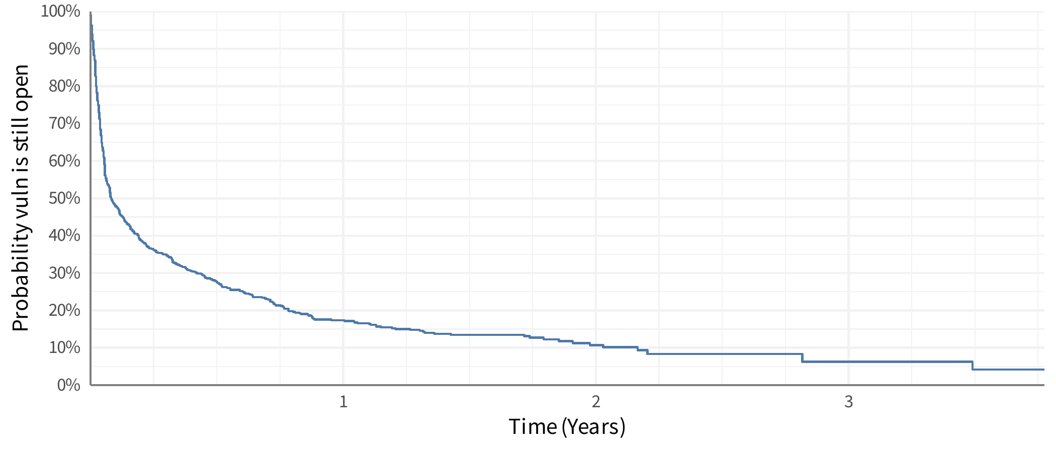
The line can be interpreted a few different ways, the most straight-forward is as a probability (likelihood) that a vulnerability will be open at some point in time. For example, looking at the plot 3 months after discovery (the first vertical light gray line) we see it intersects around maybe 36% probability. Meaning that vulnerabilities have about a 36% chance of still being open after the first 3 months. That could also be flipped around to say that vulnerabilities have about a 64% chance of being remediated in the first 3 months. Another interpretation is to say is as a proportion of vulnerabilities that would still be open. So at 3 months we would expect that 64% of vulnerabilities would be remediated.
But stop for a moment and look at that line, what’s “average” on the line? Imagine this was a large poster on the wall and you had a bright red dot you had to stick on the line to represent “average”. Where does it go? There is no clear central tendency here – most vulnerabilities are generally remediated quickly, but some aren’t and yet some hang around for years (“don’t touch that windows 95 box in the corner!”). One thing we’ve done in our analysis at Cyentia is talk about the “half life” or where the line passes 50% chance or remediation. But that cutoff could be anything, 25% or 75% or whatever. This also presents a challenge because what if that survival curve never reaches 50% (or whatever cutoff)? It’s tricky to talk about the central tendency on that curve!
The fact that we now have this curve and it’s clearly difficult to visually reduce this to a single estimation should be the first indicator that maybe MTTR isn’t a great stat. The first week after a vulnerability is discovered is vastly different than the second, which is different than the third, and so on. But, people want one number – they want one thing to hold on to, to track, to improve on or monitor for change and so on. But here’s the challenge – the mean time can only be calculated if the line reaches the bottom. Which means the longest event in the data must be a remediation event (and not an open vulnerability). In our sample data, that isn’t the case. You can see in the plot that the line dangles out there and is “open” at the end of the curve. We mathematically cannot calculate the “mean time to remediate” on this data. Are you getting a feel for where my skepticism comes from?
Wrapping Up
Let’s go back to the other methods earlier in this post. I zoomed into the survival curve and I’m showing the first six months (26 weeks) after initial discovery. For reference, I put the estimates from the first two methods on the line. Do they make sense? We may be able to look at these and see some patterns, like the “median on all” is close to where the line has a slight “elbow” in it and it’s close to 50% closed, so maybe that’s a good approach? Nope, any similarity or pattern you think you see, it doesn’t exist. All of these will be greatly influenced by how long you’ve been collecting data. If you only look at remediation data for six months, the median and mean will be shifted quite a bit to the left. If you have 20 years of data, these will be shifted to the right. How much will they shift? I have no idea and that’s kind of the point. That’s probably the primary reason I am skeptical of any claim to “MTTR” – it’s just too easy to be completely misled by the data.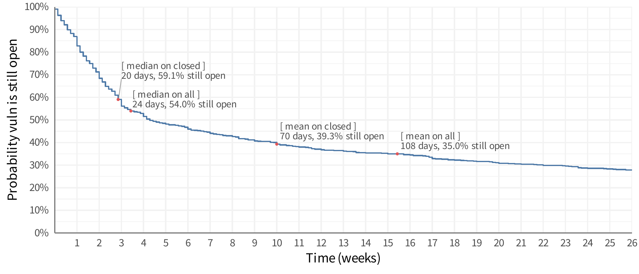
As I mentioned though there are ways to estimate the MTTR on data like this. But rather than make this rather long blog post even longer, read the details in the R documentation for the print.survfit function. It does a good job of outlining the challenges and options for estimating the mean (since that function can output the various estimated means).
One more thing
We’ve used these techniques with some really interesting results. For example this is from the Kenna Prioritization to Prediction Volume 8, figure 9 and shows the overall remediation rates for vulnerabilities found on active assets.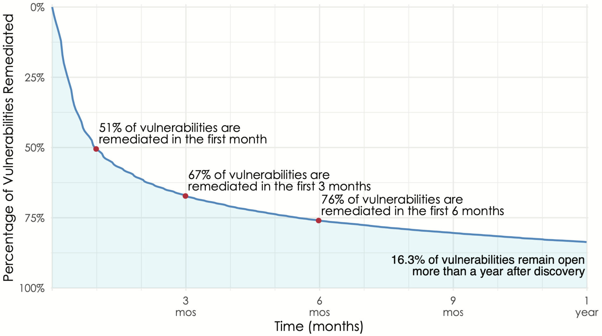 The above figure is showing the overall remediation rate and we can see dramatic differences when we split that out by vendor. In order to compare vendors, we grabbed three points from each vendor’s curve (time to close 25%, 50% and 75% of the vulnerabilities) and plotted the remediation rates for vendors in Prioritization to Prediction Volume 7, figure 10. We do this type of segmented chart because showing this many lines as survival curves turns into spaghetti. The line segments allow rather easy comparison:
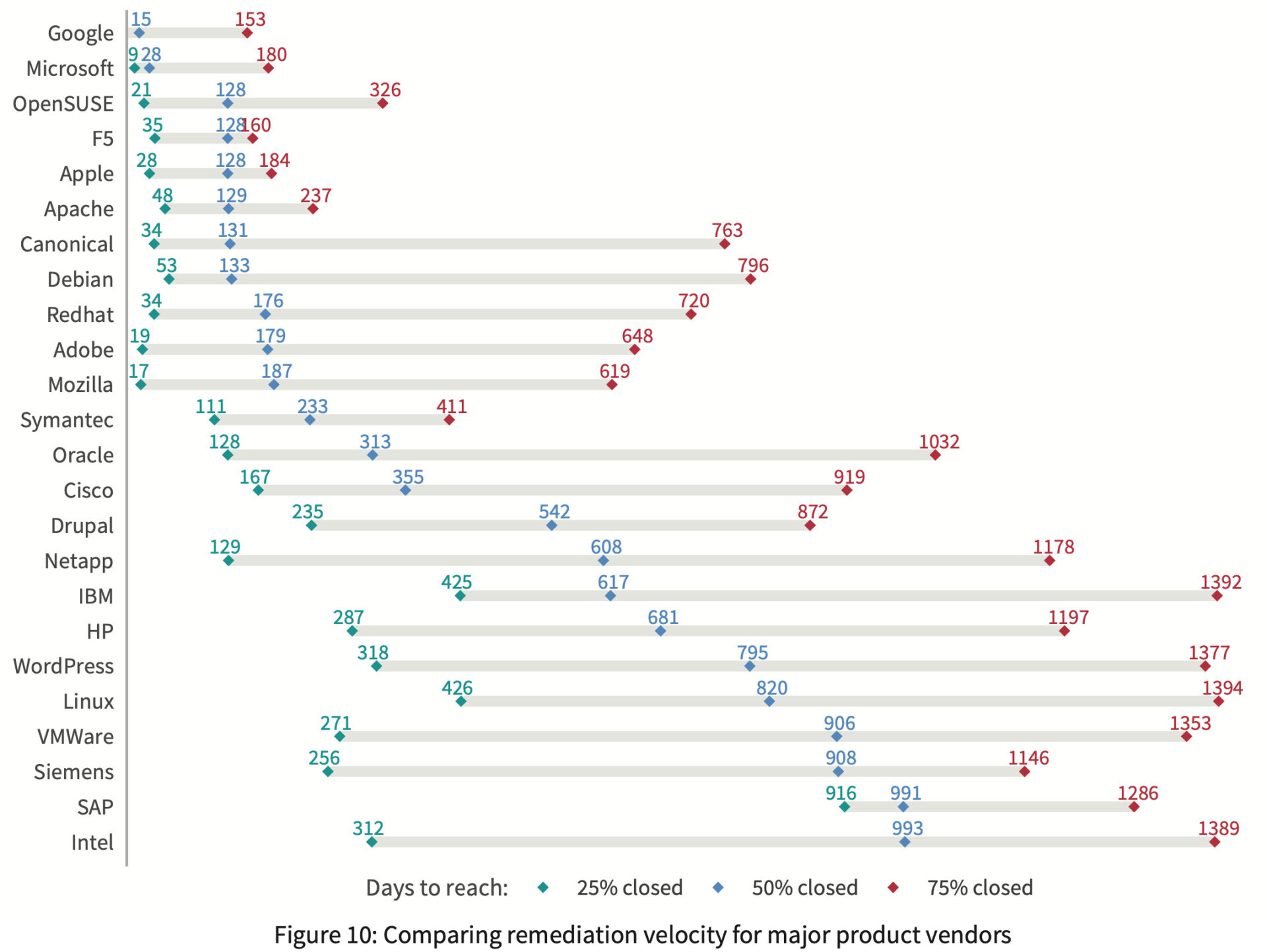
It’s cool to see vendors like Google and Microsoft (with auto-updates on chrome and windows by default) at the top of this chart, but seriously, what is up with the remediation rate of SAP vulnerabilities?