“That’s the news from Lake Wobegon, where all the women are strong, all the men are good-looking, and all the children are above average.” – A Prairie Home Companion
We have harped on the inadequacy of a single “average cost per record” value (and averages more generally) when analyzing cybersecurity event losses several times before, for example in both the IRIS 2020 and IRIS 2022 reports. However, we do keep seeing figures in this vein being produced and shared every year, so we think it’s worthwhile to provide a corrective reminder at least once every few years or so. As the Springfield city bus driver said:

So let’s update the graphic that we’ve used in past IRIS reports to illustrate this issue. The following chart shows the cost per record versus the number of impacted records for incidents from roughly the past 15 years. Both axes are on a log scale because the distributions are so heavily skewed.
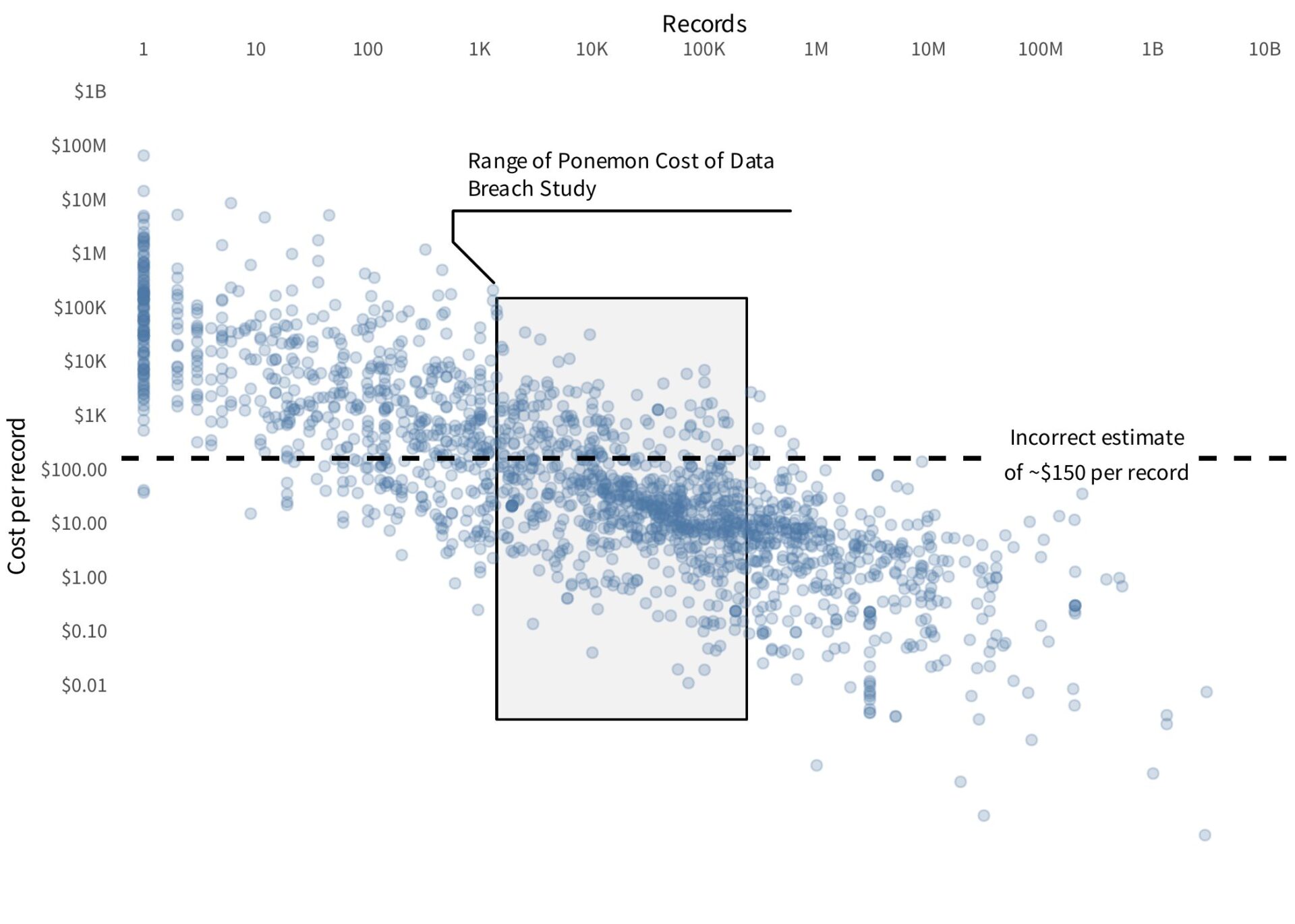
The shaded region indicates the range of events to which the 2025 Ponemon Cost of a Data Breach Study “average cost per record” metric can be applied. The dashed line represents the single “average cost per record” estimate. (Note that the 2025 report appears to have reported the average cost per record only by record type, not overall, but any value in the range they reported would be visually indistinguishable on the log scale used here.)
As we have noted before, not only does the single value fail to capture a “typical” cost per record within the applicable data, it is even less accurate for the vast majority of incidents outside the scope of the Ponemon report.
To clarify just how misleading this single average cost per record value is, let’s focus in on only those incidents in the shaded region. If we use the single average cost per record to estimate the total losses for just those events, we can calculate the probability of an error of different magnitudes. This is displayed in the following figure.
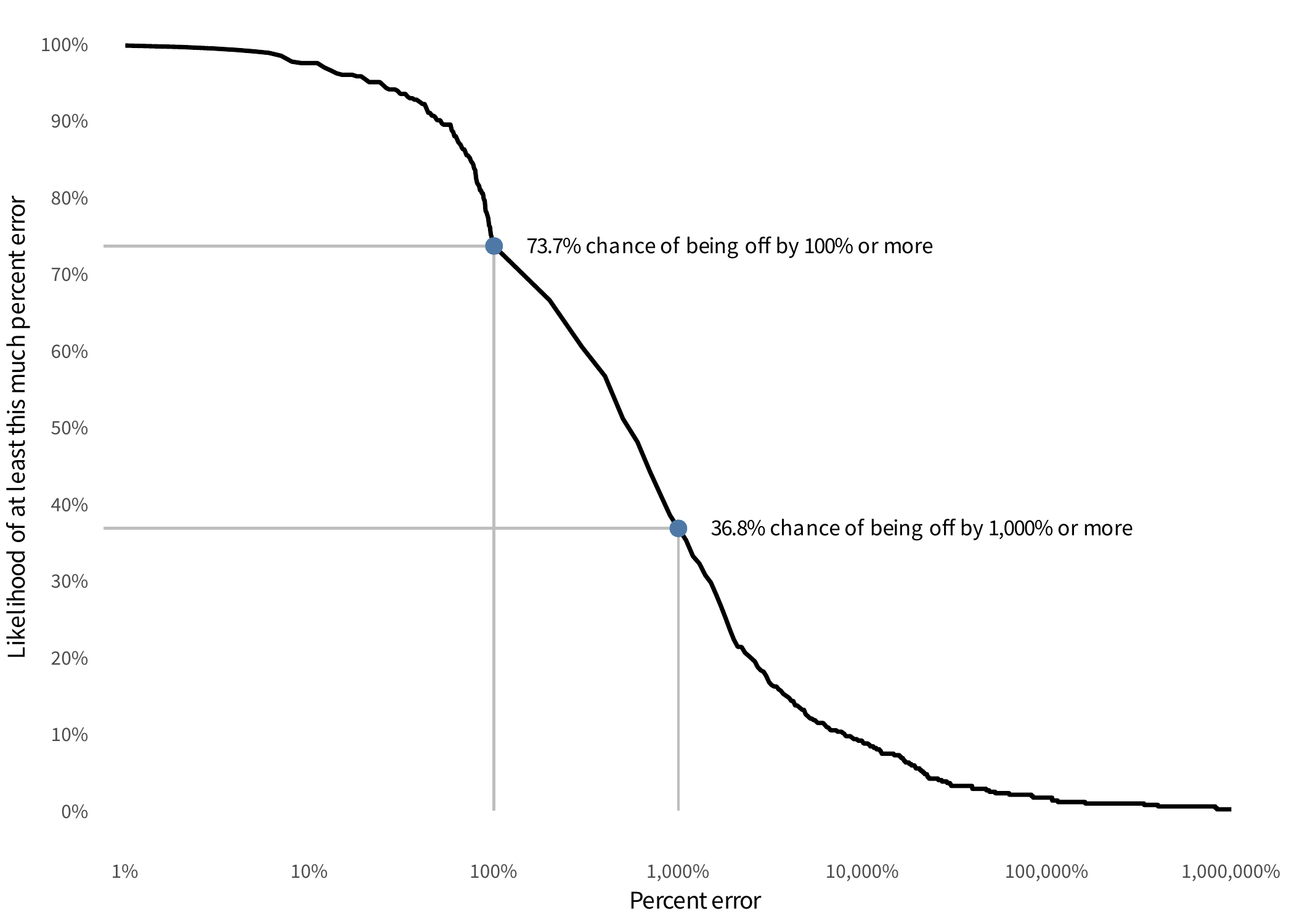
If we use a single cost per record estimate only for the incidents it claims to be applicable for, there is ~74% chance that our loss estimate will be off by a full 100% or more! In other words, if our loss estimate is $1M, then there’s a ~74% chance that our error is greater than $1M. Also annotated on the chart is the even scarier fact that there’s a ~37% chance that our estimate is off by 1,000% or more, i.e. a factor of 10x!
This is why we always try to report, at a minimum, the median loss and extreme quantile of the losses, like the 95th percentile. Or even better, we explicitly model and report the full distribution, so that risk estimates can be phrased with more precise probability statements.


