We recently had Christos Mitas on the Cyentia Podcast. Christos works in the insurance industry creating models of natural catastrophes (among other areas). Just a little over six minutes in, I asked him how the risk from catastrophe models were communicated. This is a critical question because risk communication could be thought of as a whole separate problem beyond modeling and analyzing probable future harm. My thinking was, if he could point to where we should go, how we get there may be more clear. Christos said they’ve had success in using exceedance probability curves. I’ll be honest, I was fishing for that answer and I was really happy that was the first thing he brought up.
To understand exceedance curves, I want to step back first and talk a little about loss and insurance. Let’s start small with those “extended warranty” plans. You know those plans, when you buy pretty much anything nice and you are offered a very specific insurance plan to cover your purchase. If you drop your new phone, the dog chews on the new couch or spill coffee onto whatever the thing is, those extended warranty plans promise to take care of everything. But that peace of mind comes at a price. So the decision is whether the cost is worth the benefit? Let’s say on average, 1 in 100 people will experience a loss event on a $1000 purchase. In theory, the warranty should cost 1% (1 in 100) of $1000, or $10. However, in reality, there is overhead, employees to pay and profits to collect. So logically — you will always pay more for insurance than the expected loss. So when I think about purchasing that extended warranty, I try to think logically: Could I cover the loss of this rare event? If I know I cannot cover the losses (e.g. replacing my home) I transfer the risk (buy insurance). If I know I can cover it (like a cracked phone screen), I accept the risk and decline the extended warranty. So the decision is all around figuring out if the losses will exceed my threshold. I want to know how bad things may be and if I can cover the losses myself or if I will need help.
This is why Christos talked about communicating risk with exceedance probability curves and why I was fishing for that answer. Exceedance probability (EP) curves (also called loss exceedance curves or just exceedance curves) communicate that answer. EP curves visually display the probability that loss will exceed some amount within some period of time (usually annually). On one axis is a range of losses and it may be shown on a log scale (depends on the system being modeled). On the other axis will be a representation of the probability and since people are generally terrible at probability, this is often expressed with a period of time (e.g. 1 in 100 year flood). Oftentimes that axis will be labelled as “return period” (the period of time the hazard is likely to return as severe). Doing a quick image search for “exceedance probability” may help to comprehend what’s involved in an exceedance curve.
How are EP curves created?
Now we have a goal for communicating risk… how do we get there? There are lots of moving parts here, but let’s focus just on the technical aspect. Let’s also stick with traditions in probability and talking about games of chance, specifically roulette. Now roulette is especially fun as an example, because the probabilities are known; plus I’ve played around with roulette in the past. If we start with the assumption that a person could play about 250 spins of the wheel in an evening, and is playing in North America (double zeros table), and they stick to bets with 1-to-1 payouts (red/green, even/odd), then the probability of a specific outcome at the end of the night will look like this: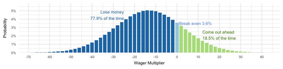
The “Wager Multiplier” is multiplied against whatever the gambler wages. For example, the probability of the wager multiplier being -6 is about 4.5%, which means if the gambler bets $5, they have a 5% chance of losing $30 dollars (-6 * $5).
We have probable loss from an event of an evening of gambling on roulette and we can calculate the probability of exceeding specific amounts. For example, when we calculate the median loss, it’s exactly -14 which means 50% of the time, with $1 bets, the gambler will lose more than $14 and 50% of the time they will do better than losing $14 (which is awkward to say). Another way to say that is to talk about the “return period” which is an evening of gambling in this case and we are focusing just on exceeding losses, so could say, “Losses will exceed 14 times the wager for a 1 in 2 evening event.” The return period is calculated as the inverse of the percentile. So at the 50th percentile, we have 1/0.5 or 2 return periods.
Sticking with the 1:1 payouts we can loop through the percentiles, calculate return period and loss to create the follow exceedance probability curve:
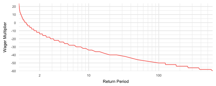 Doing this for something with a positive (winning money) is a little strange since as we found, it’s rather awkward to say “we expect to do worse than winning 8 times our wager 9 out of 10 evenings.” But this first EP curve we created still captures the process, A 1-in-2 evening event (50% of the evenings) we’d expect to lose more than 14 times the wager, 1 out of 10 evenings (10% of the evenings), we’d expect to lose more than 34 times the wager, and for the 1 in 100 evening events (1% of the evenings) we could expect to lose more than 50 times the wager.
All Possible Roulette Bets
We can repeat that process for all possible bets/payouts in roulette, smooth out the plots a bit and create the exceedance probability curve for roulette:
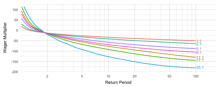 This mirrors previous roulette visualizations where larger payouts have more risk and more reward. But look at the various exceedance curves in that plot, imagine that they were natural catastrophe loss events based on location, or perhaps imagine what these would look like for losses from breaches across different industries. With enough loss information and the interest of insurance modelers, EP curves are not only possible, but at this point, EP curves are inevitable for cybersecurity.
I’ve glossed over some of the messy details for this post. For example, the probabilities in roulette are already established, so they can be represented as lines in the EP curve. But in a domain like security, we are dealing with rare events that are often poorly documented and often has quite a bit of uncertainty around the true underlying probabilities. This makes the line a bit more fuzzy and limits the accuracy of the EP curve as the return period gets larger. But hopefully you understand enough about the EP curve to recognize one, see the value and maybe even request it from risks analysts or try to create one for yourself!
Update 1:
If you’d like to learn more about EP curves in cybersecurity, Richard Seierson and Douglas Hubbard’s book on How to Measure Anything in Cybersecurity Risk discuss it in Chapter 3 and you even download a spreadsheet to play around with EP curves on your desktop!
Update 2:
Updated on Apr. 28, 2023 to refer to the 2nd edition of HTMA in Cybersecurity Risk.