We recently released our 6th joint research report in the “Prioritization to Prediction” series with Kenna Security. I’d like to walk through one chart from that report with you in this short blog post and share my perspective on why I think this is one of the most important pieces of research we’ve published yet.
But first, I have something I need to get off my chest: I get a disproportionate amount of public credit/kudos for the incredible analysis and visualizations produced by the Cyentia Institute. Some of that goes back to my work (with many other people) on the Verizon DBIR and people seem to assume I’m behind a lot of the analytical work we do at Cyentia. But the truth is that I didn’t directly create a single chart for the DBIR after Jay showed up (circa 2012 or 2013) and, outside of a couple rare examples, I don’t do the primary data analysis or visuals for Cyentia research either. And I didn’t create the chart I’m about to share with you from the latest Kenna report. Well…that’s not actually true. Here’s the version of the chart I created:
So, that’s the kind of datashiz you’d be looking at if I was responsible for data visualization for Cyentia reports. Yeah – I know. Buy Jay, Ben, and David a drink next time you see them for not subjecting you to that kind of visual torture. The chart below is the version Jay created for inclusion in the report. A wee bit of improvement, huh? Let me set some context for what you’re looking at here.
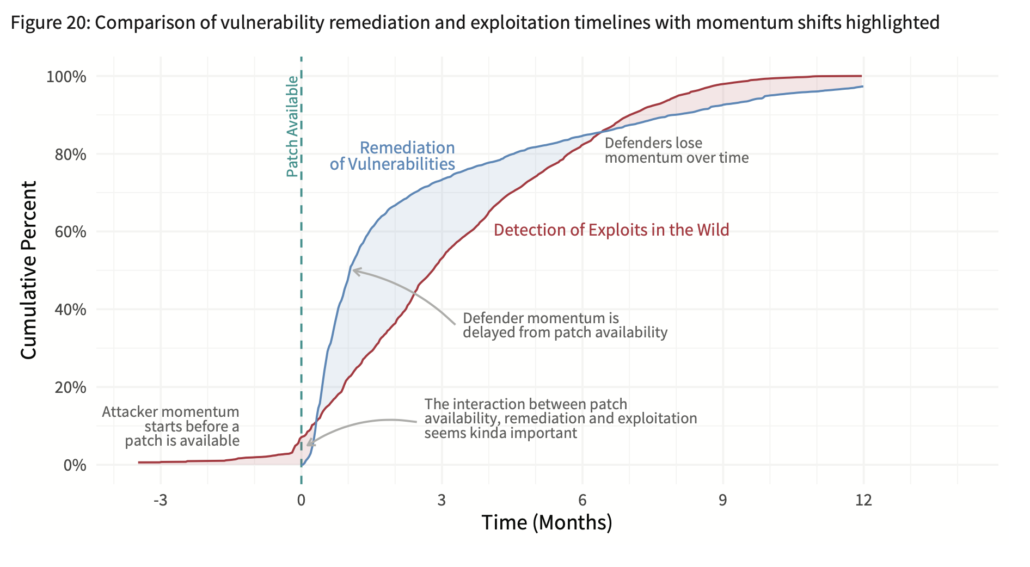
In Prioritization to Prediction Volume 6 we focus on 473 vulnerabilities with evidence of exploitation in the wild. That evidence of exploitation comes from six independent sources of varying types (IPS, anti-malware, threat intel, etc.). For each of those 473 vulnerabilities, we identify a set of key milestones such as when the CVE was published, when the patch became available, when/if exploit code was released, when it was found by vuln scanners, and when it was first detected as exploited in the wild. There’s an absurd amount of charts in the report measuring and comparing those milestones from every conceivable angle. If you’ve ever wanted a peek into that world, this is the best view I’ve ever seen of it.
Back to the chart. The blue line shows the average time-to-remediation for vulnerabilities across several hundred organizations. Following that line shows that it generally takes about 5 months from the time a patch is available for firms to remediate 80% of vulnerabilities across their environment. The red shows the spread of exploitation attempts from the first organization that detected related activity to the last (sometimes that’s just a few firms; sometimes it’s tens of thousands). Tracing that line reveals that it typically takes 6 months for attackers to reach 80% of their target population.
Just being able to see those two timelines on the same chart (data-driven, not hand-drawn) made me all giddy inside. But the interplay between those lines blew my mind. I expected attackers (or red teamers) to have first mover advantage (see the red shaded area from 3 months prior to patch until a week or so after). What I did not expect was to see defenders kick it into high gear after patch release and actually fix flaws faster than exploits spread in the wild for the next 6 months. After that, the law diminishing returns seems to set in and attackers steal back the momentum as defenders struggle with all those hard-to-find-and-fix assets strewn about their environment.
This figure shows an overall average across all vulnerabilities and the dynamics between attackers and defenders are much more varied than the clean set of curves you see here. The report goes on to show how the apparent defender advantage can be dramatically diminished by swapping the order of just two milestones in the vulnerability lifecycle, but I’ll let you grab the full report for that. For now, this is a really good start to a really important concept, and I’m thrilled we were able to bring the data together to create it. And I’m pleasantly surprised to learn that defenders outpacing attackers isn’t merely a fairy tale.