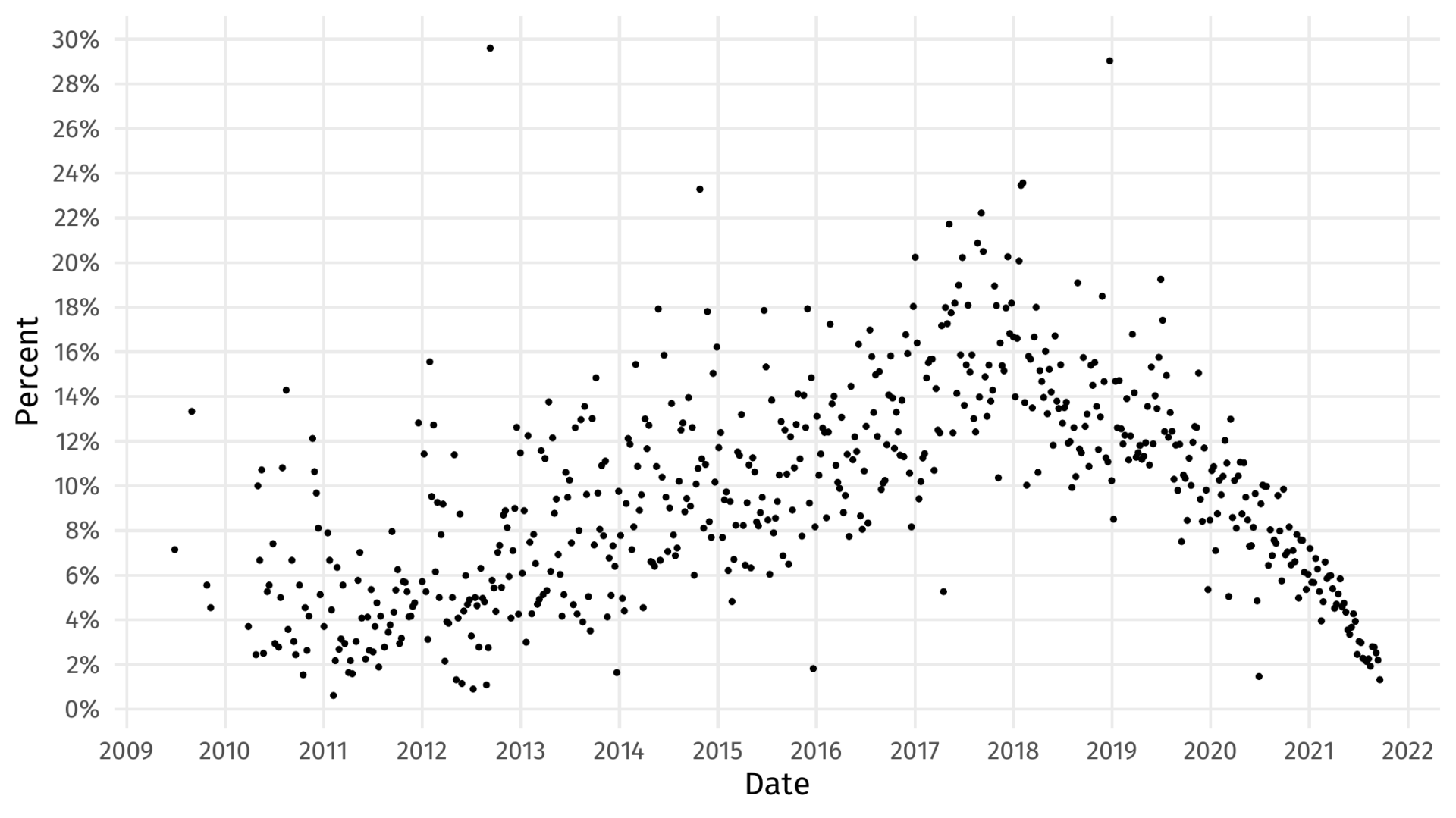
A scatter plot showing nearly 600 points. The horizontal axis spans from 2009 to just shy of 2021 (labeled Date). The vertical axis spans 0% to 30% and is labeled “Percentage”. The data around 4% in 2009 and is sparse but appears to descend to 2% by 2012, then rises to about 16% in 2018, before declining to nearly 2% in 2022.
The data is scattered with some scattered outliers as high as 30%
Leave a Reply
Want to join the discussion?Feel free to contribute!