New year, new methodologies post. In our last post, we chatted about the best way to present multiple regression results, pulled back the curtain on last years Cisco Security Outcomes Study, and gave a sneak preview of this year’s results. Speaking of this year’s results, download Volume 2 of the Security Outcomes Study here.
Honestly, I could talk about all the stuff that didn’t make it into the report all day. I’ve got some 415 figures sitting in my analysis drive and only 24 made it into the final report. I could wax poetic about p-values thresholds and appropriate link functions and the strengths and weaknesses of each methodology. We debated pros and cons of the binarization of practices and outcomes. We considered a bunch of different Likert scales for the questions. I could dive into the half dozen ways or so we considered visualizing confidence intervals. But there was one particular piece of methodology in the upcoming report that deserves special attention.
Security Outcome Score Methodology
Last year we identified 11 different security program outcomes, they show up on the vertical axis in the heat map figure in the previous post. We also added an outcome to “Maintaining Business Continuity” for a cool dozen outcomes. We also tweaked the responses and asked whether they felt they were “Failing, Struggling, Succeeding, or Excelling” at each. So how do we transform 12 questions on an ordinal scale into a quantity that we can reason about?
Intro to Item Response Theory
As I have found throughout my data science career, if there is a question about data, some statistician, probably several decades ago, has developed exactly the methodology you need. This time the solution comes in the form of a set of models referred to as “Item Response Theory” models.
These types of models are used, among other things, to create standardized test scores. They work on the principle that different questions (or in this case outcomes) might be more difficult to achieve than others, and therefore people (or security programs) should get more credit for achieving them. It also posits that each security program has an underlying ‘score’ that makes it more or less likely to achieve each outcome. In equation form:
Pr(Excelling_i) = f(θ-δ)
Where θ is the ability of the respondent, δ is the difficulty of getting excelling on outcome i and f is the standard logit transform. There are a myriad of extensions to this approach. We use one here where that allows each outcome level (“Failing” to “Excelling”) to have increasing difficulty. What’s feels so magical about this approach is we are inferring a latent (ie unobservable) variable that drives a security program. It’s not gonna be a perfect representation of the program, but in the same way standardized tests do, gives you a broad sense of how things are going.
We applied it here and got some pretty great results! First let’s take a look at the difficulty of the 12 outcomes.
Outcome Difficulty
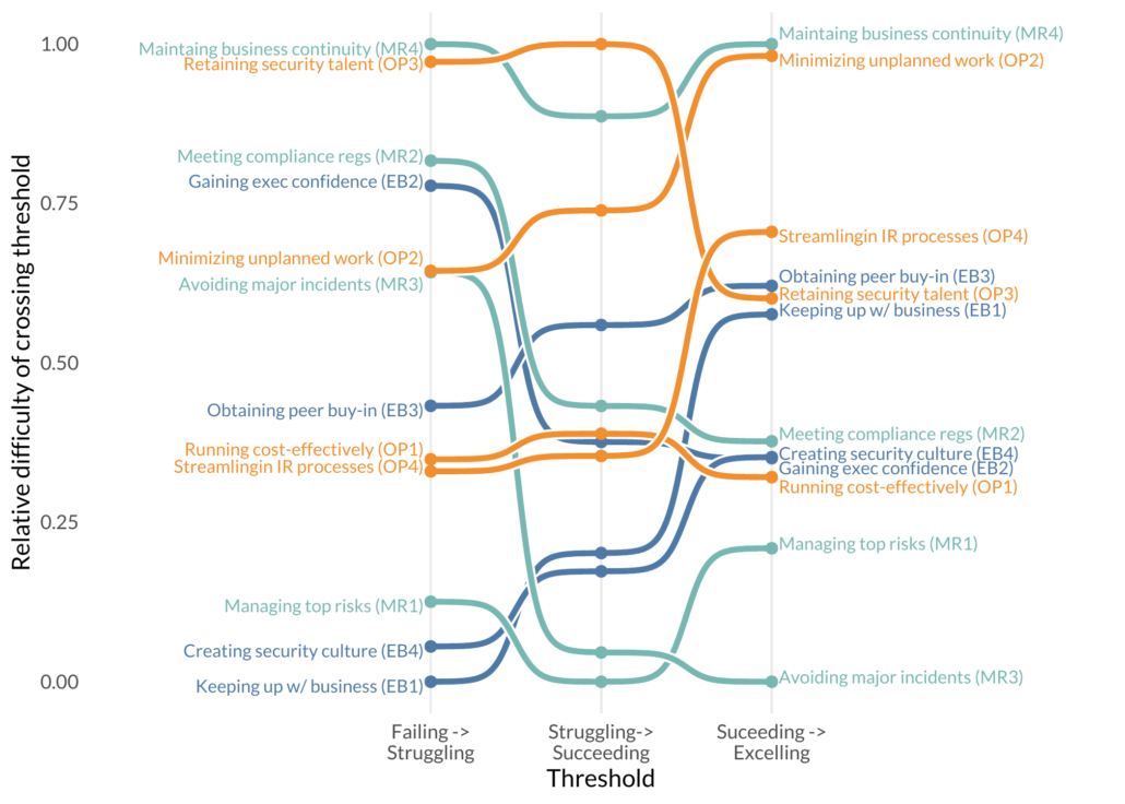
The vertical axis shows the relative difficulty of moving up to the next threshold (horizontal axis). A few interesting observations. Avoiding major incidents is relatively difficult to get from “Failing” to “Struggling”, but once you get to “Struggling” it’s one of the easier outcomes to improve. “Keeping up with business” is relatively easy to get from “Failing” to “Struggling”. Unfortunately, it gets increasingly hard to get to “Excelling”. Maintaining Business Continuity seems to always be hard, where “Managing top risks” is relatively easy.
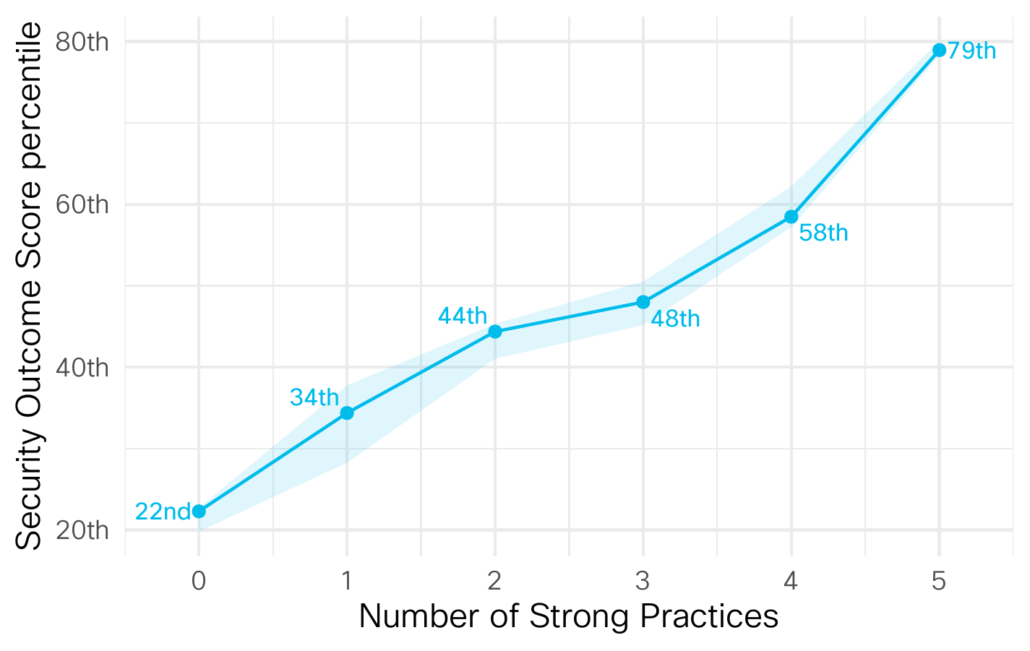
But that’s only half the model results, the other half is the respondent outcomes. These scores allow us to check just how well certain practices affect an organization’s overall security program. So here is one big takeaway, the more practices you develop the better your security outcome score.
Organizations that don’t do any of the 5 practices well (Proactive Tech Refresh, Tech Integration, Timely Incident Response, Prompt Disaster Recovery, and Accurate Threat Detection) are in the bottom fifth of all security programs. Those that do all 5 well are in the top fifth.
There is of course more we could talk about, but I think this blog post has gone on long enough. Grab Volume 2 of the Security Outcomes Study here. Until next time friends.