Can you feel it? The palpable feeling that we are on the verge of something extremely groundbreaking? Of course you can¹. In your very bones you know it’s almost time for the next edition of Cisco’s Security Outcomes Study. Once again Cyentia has been tasked with throwing some light on the fear, uncertainty, and doubt that plagues our industry.
But how can we be a guiding light when all other lights have gone out? Through rigorous statistical methodology and data analysis of course! Last year we partnered with Cisco to publish the Security Outcomes Study. In it we examined 25 different security practices and how they affected 11 security program outcomes. The results were illuminating, and if you are wondering how you can improve your security program today, I’d pick it up and get studying.

This should be you studying last year’s Security Outcomes Study
If you remember last year, Wade gave an account of how Cyentia came into possession of such powerful data. In that post, he promised a follow-up about some of the methodology used to forge our results. Whelp, that blog post was a long time coming, but here it is. We’re going to talk for a little bit about the statistical analysis in the last report, and give you a little preview of what’s to come in the next volume.
Regression Methodology for Measuring the Effects of Security Practices on Outcomes²
As a reminder, we asked respondents in our double blind survey about the quality of their security practices. For example:
“On a scale of Strongly Agree to Strongly Disagree, how much would you agree with the following statement ‘Our threat detection capabilities provide accurate awareness of potential security events without significant blind spots’?”
We also asked about a self-assessment of the performance of parts of their security program. An example of this would be:
“On a scale of 1 (Struggling) to 4 (Succeeding) Please rate your organization’s performance at managing the top cyber risks”
These two questions hopefully make clear one of the many research hypotheses we could investigate. For example, “Does accurate threat detection lead to more success managing top cyber risks?” I know what you are thinking. “Fire up Excel, rock that CORREL function, and declare ‘Victory!’”. Well you’d be wrong. There are many reasons not to use a Pearson correlation coefficient on an ordinal variable, but there is definitely not enough room in this blog post. Read this pdf instead. If not Pearson, then what? We could use some weird correlation techniques or try some strange regression models. A better solution might be to just take a gander at the data.
Binarize All the Things!
When we did that, we saw that respondents broke nearly evenly into two categories for most questions: “rock stars” and “not rock stars”. That is, they either answered the highest value or somewhere below that. So we followed the data’s lead and did the same, we distilled everyone’s answers on practices and outcomes to either “Doing good”, “Doing less than good”. While this type of simplification drops some information, it allows us to use more well-known methodologies. It also simplifies the visualization and explanation of the results³. But what methodology should we use on our new binarized data?
Simple Regression: Not Great.
Since all the data is one of two values, we can easily run some simple logistic regressions. We started by taking each pair of practices and outcomes and running their own separate logistic regression model. Here is an early version of the “hero” chart for last year’s report:
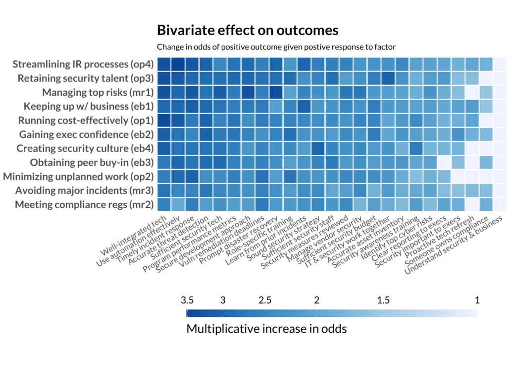
EVERYTHING IS CORRELATED WITH EVERYTHING!
This seems a little too good to be true. Every practice means better outcomes. If your tech is well-integrated, you are probably finding automation effective. If you have clear reporting to executives, executives probably feel security is important (we hope). But something stinks about this methodology. There is just too much good news. Not every practice should be equally important and influence every outcome. We’ve failed by examining every practice in isolation, rather than taking them all at once, measuring their effect while accounting for the effects of other practices.
Multiple Regression: Much Better.
The solution? Switch from simple to multiple logistic regression. For each outcome, we included all the practices as independent variables and the outcome as the dependent variable. In this way we can account control for some of that collinearity and see what practices are really making a difference. Below is the chart that appeared in the report, but you should really head to the splash page and muck about with the interactive version.
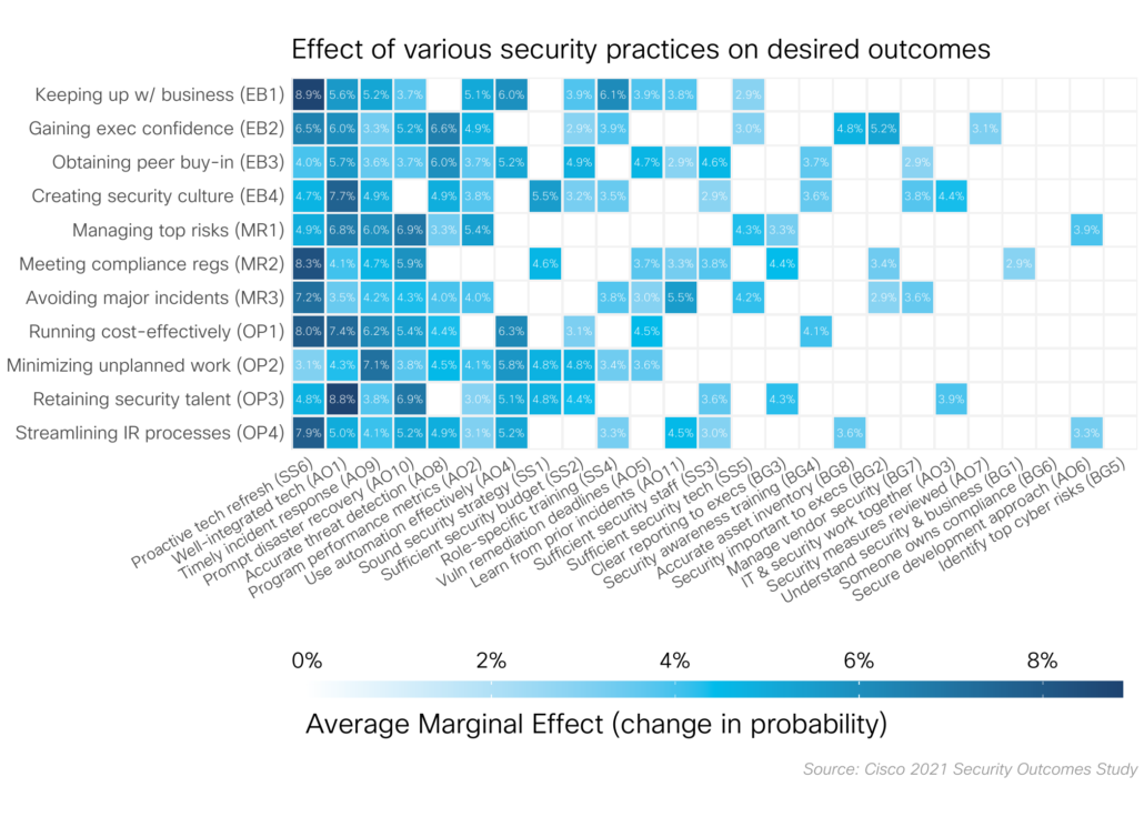
The better statistical approach
Decoding regression effects
Odds: Confusing to All but Gamblers
Eagle eyed readers will probably notice that the “bi-variate” plot as the color scale labeled as “Multiplicative increase in odds” while the final chart says “Average Marginal Effect”. “Odds” are an alternate (somewhat confusing) way of expressing probability, and one usually reserved for off track betting. It’s the ratio of the probability of having a positive outcome to the probability of having a negative outcome.
Let’s try to put this in the context of some of the Security Outcomes Study outcomes. In the main report approximately 36% of respondents said they were succeeding at minimizing unplanned work. This gives us 9 to 16 odds = 0.36/(1-0.36) of being successful in that particular outcome. But our modeling work tells us that if a program has a “timely incident response”, their odds of minimizing unplanned work goes up by a factor of 3! That 9 to 16 odds suddenly turns into a 27 to 16 odds, and things are looking a bit rosier.
Average Marginal Effects: Better but Not Perfect
Jeepers, that was a lot of math and mental effort to figure out exactly what “timely incident response” buys an organization. There must be a better way. Enter “Average Marginal Effects”. Average marginal effects attempt to answer the question “How would the probability of a particular outcome change if everyone did a particular practice?”. Using this methodology we can take all the non-linearity, messiness, and odds ratios of logistic regression and just report, “if I do X how much more likely am I to succeed at Y?”.
Now, it’s not to say that average marginal effects fix everything. While odds are easy to combine (doing A and B results in the odds going up by the effect of A times the effect of B), no such simple combination is possible with average marginal effects. So it’s not like you can get a better than 100% likelihood of an outcome by stacking practices, but at least we have a little bit of an easier time communicating those single practice → income relationships.
But Can We Make it Simpler?
While Average Marginal Effects definitely helped us last year, we took at step back and tried a different method for presenting those regression results for volume two. For this year’s report we focused on the top five practices that really seemed to universally drive better security outcomes:
- Accurate Threat Detection
- Proactive Tech Refresh
- Strong Business Continuity and Disaster Recovery (BCDR)
- Timely Incident Response
- Well-integrated Tech
We specifically wanted to know how exactly to achieve success in those practices. There is a lot of great stuff in the main report and I don’t want to spoil any of the big reveals. Methodologically, we proceeded in more less the same way. Start with multiple logistic regression with the practices as the dependent variable, and a pile of details on how people implemented that particular portion of their program as the independent variables. We then examined whether we saw a statistically significant effect between how people were doing things and the strength of a specific practice.
Always Simplify
But rather than give you big heat maps of average marginal effects like last year, we decided to zoom back out and just show the data. For example, we tested whether respondents felt they had strong business continuity and disaster recovery (BCDR) and asked about things like Backups, Chaos engineering, and tabletop exercises. Once we found out that, for example, having full backups contributed to strong BCDR, but differential backups didn’t, we just visualized the responses.
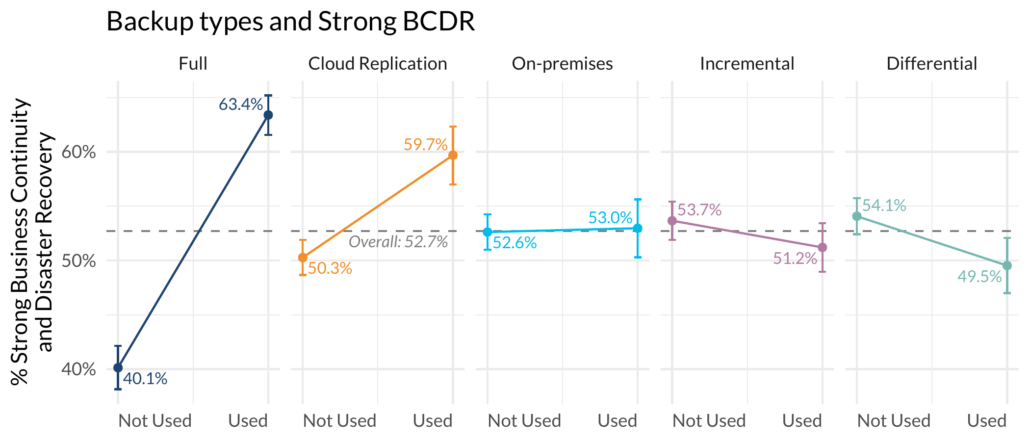
Some backups matter, some don’t.
Note you are getting the premium, never before seen results here. We thought this was a little more clear way to say what works and what doesn’t. Specifically, you can see that those that have full backups are much more likely to say they have strong BCDR than those without. Those 95% confidence intervals outside the average also give you an indication that these are significant, even outside the context of a regression model.
I have one more bit of methodology that I got to deploy in this year’s study that I can barely contain my excitement about. But, this post is already a little long in the tooth.
¹“The security world is changed. I can feel it in the networks. I can feel it in the endpoints. I can smell it in the discourse…”
² The most academic subheading I think I have ever composed in my entire PhD life.
³ Of course we couldn’t not test out all those weird models on the ordinal data. Let me assure you that I generated a great deal of heat with my laptop testing out all kinds of models. None were qualitatively different than what we showed.


Leave a Reply
Want to join the discussion?Feel free to contribute!